
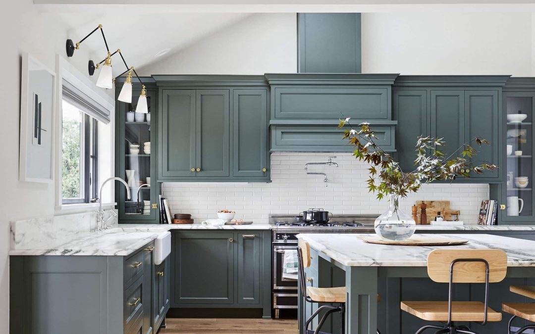
Cover Image: @em_henderson
Choosing the right paint color for your home can feel like a daunting task. Whether you’re refreshing a single room or reimagining your entire home, the color you choose sets the tone and mood for the space. With so many options out there, it can be hard to narrow down the perfect shade that will complement your style, furniture, and lighting.
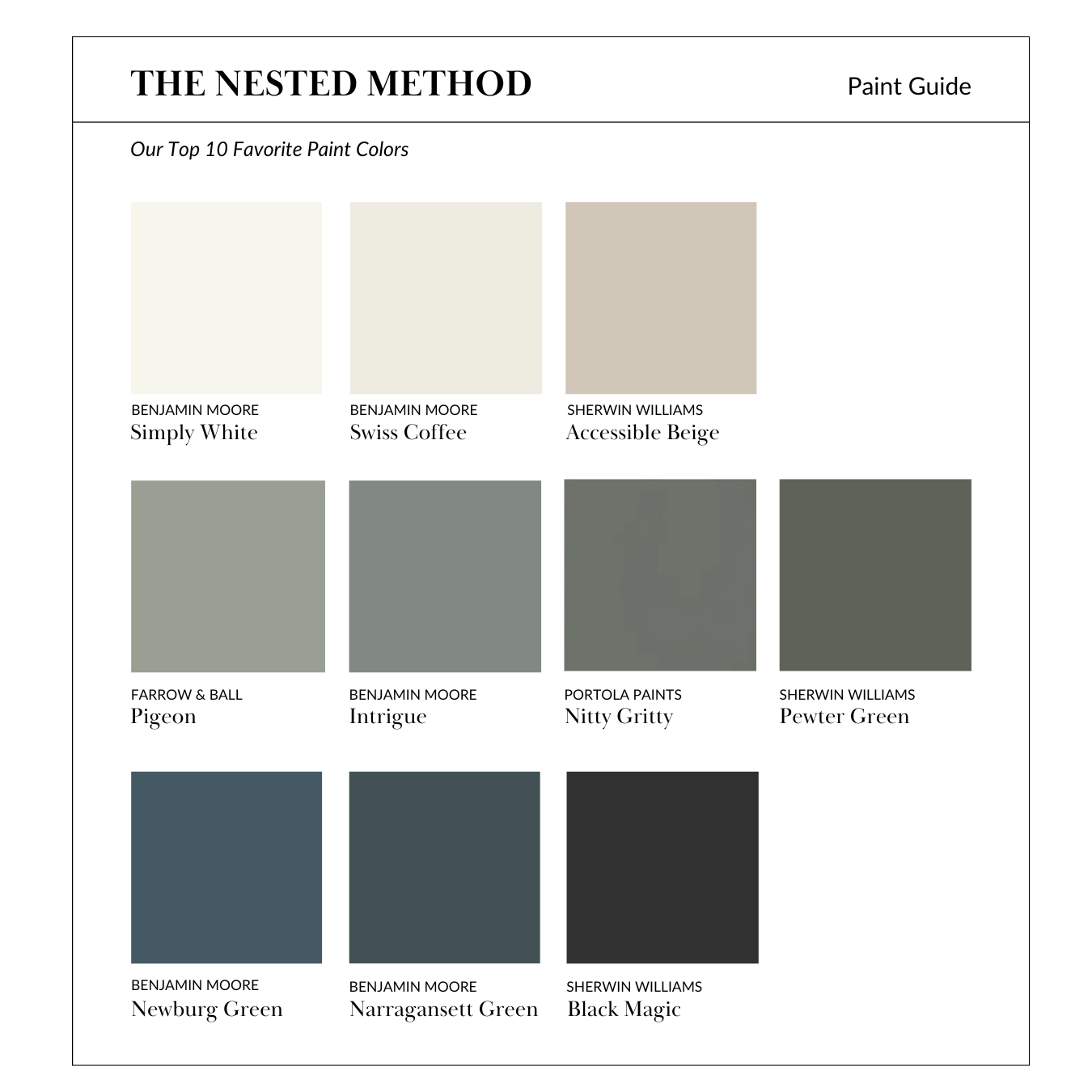
Luckily, we’ve done the legwork for you! Below, you’ll find our top ten favorite paint colors that have become beloved by homeowners and designers alike. These colors are versatile, timeless, and work well in a variety of spaces, from cozy living rooms to sleek, modern kitchens. Let’s dive into the shades that can elevate your home’s design.
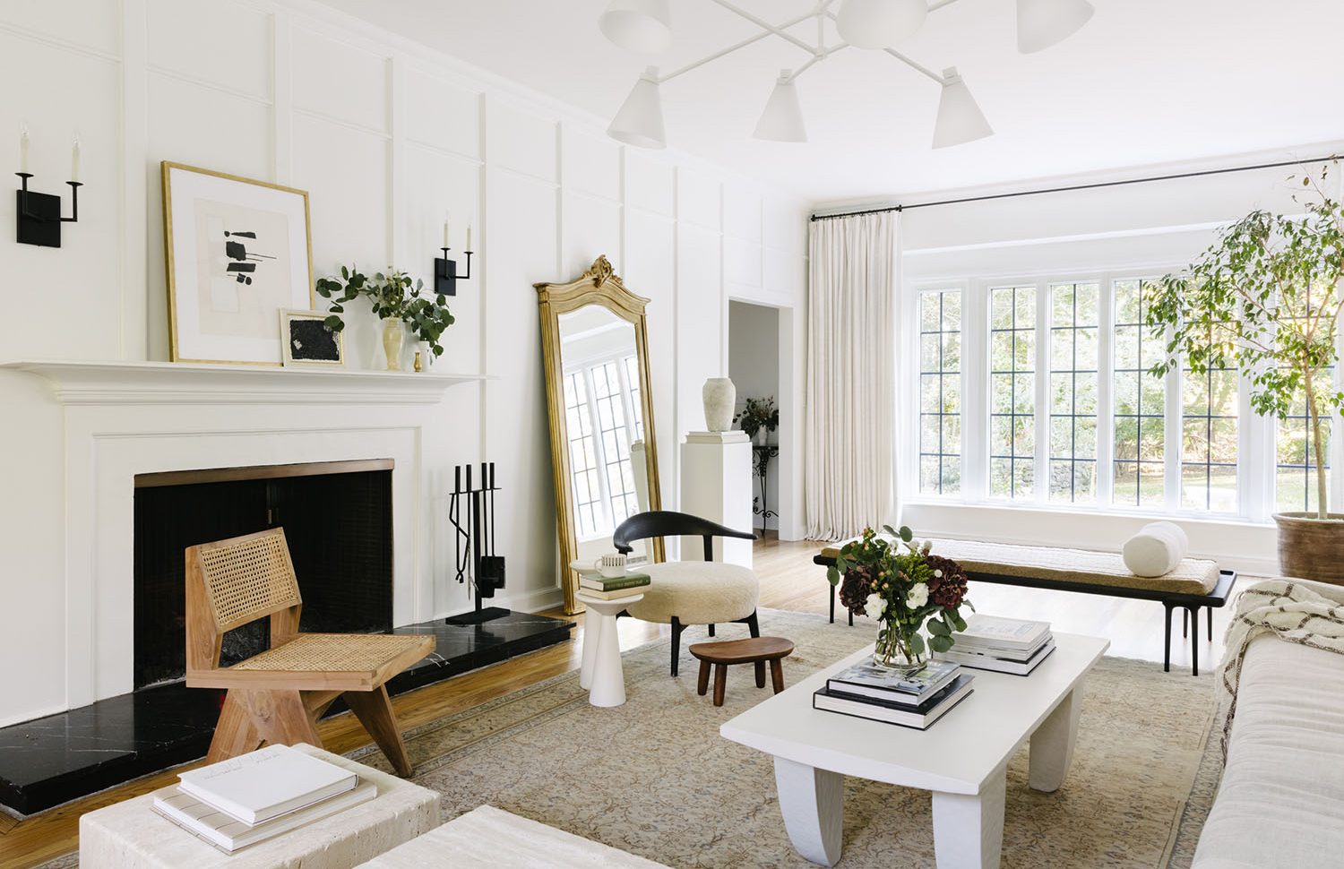
1. Simply White by Benjamin Moore
Simply White is another excellent neutral, but it leans more on the side of crisp, clean white than Swiss Coffee. It’s the ultimate pure white without harsh cool tones, which makes it incredibly versatile. Whether you want to make a small space feel larger or give a modern edge to a traditional room, this color can do it all.
Why We Love It
- Classic: A clean and fresh white that never goes out of style.
- Modern Elegance: Adds a sleek, minimalist vibe to any room.
- Pair It With: Bold accents like navy, black, or vibrant greens to create contrast.
Best Used In: Kitchens, bathrooms, or any space where you want to maximize brightness and simplicity.
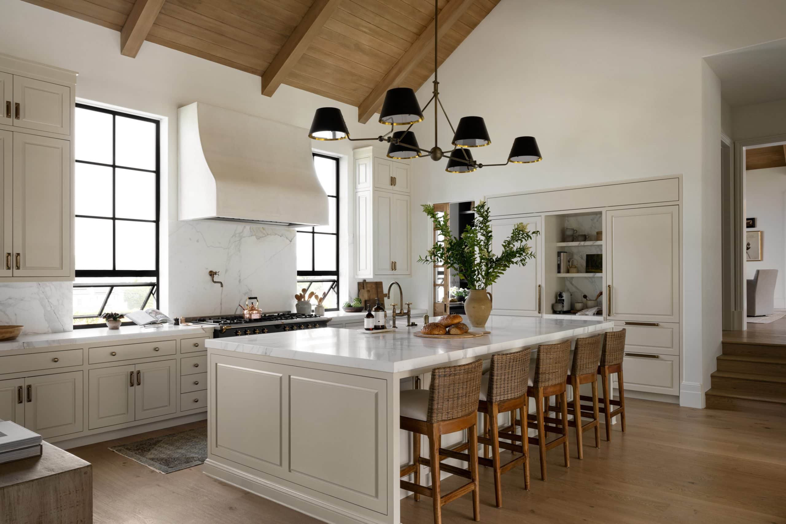
2. Swiss Coffee by Benjamin Moore
Swiss Coffee is a classic off-white that has been a designer favorite for years. It has a soft, creamy undertone that makes it warmer than stark whites, giving your space a cozy yet bright feel. This color is perfect for anyone looking for a clean, neutral palette that still feels inviting.
Why We Love It
- Versatile: Works beautifully with both modern and traditional design styles.
- Reflects Light: Brightens rooms with natural light, making smaller spaces feel more open.
- Pair It With: Earthy wood tones, soft greys, or black accents for a sophisticated look.
Best Used In: Living rooms, bedrooms, or kitchens that need a light, airy feel without feeling too sterile.
Source: Wall Paint Studio McGee
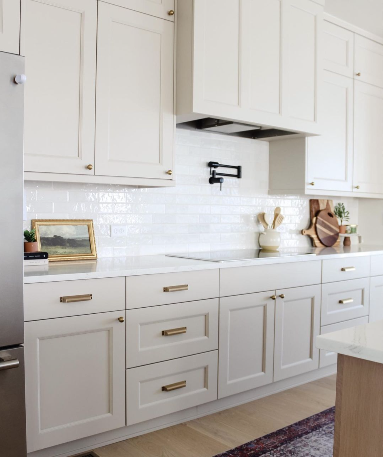
3. Accessible Beige by Sherwin Williams
Accessible Beige is the ultimate neutral for those who don’t want something too cool or too warm. This shade leans more towards greige, making it the perfect backdrop for just about any design style. It’s modern, but with a warm, welcoming vibe.
Why We Love It
- The Perfect Neutral: Balances warm and cool tones, making it incredibly versatile.
- Subtle and Sophisticated: Adds warmth to a room without overwhelming other design elements.
- Pair It With: Crisp whites, soft greys, or muted blues for a fresh, modern look.
Best Used In: Living rooms, hallways, or bedrooms as a soft, neutral base for any design scheme.
Source: @the.whipple.home
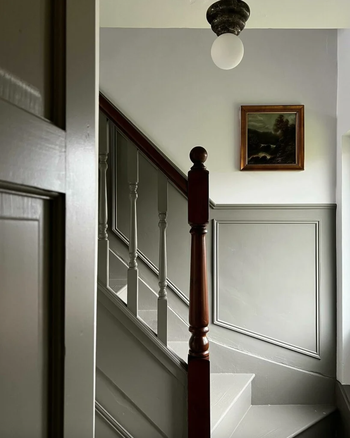
4. Pigeon by Farrow & Ball
Pigeon is a gorgeous grey-green hue from Farrow and Ball that has a subtle warmth to it. This color has a vintage feel that works well in both modern and traditional spaces. It changes with the light, sometimes appearing more grey, sometimes more green.
Why We Love It
- Classic yet Unique: A sophisticated choice that feels timeless but still offers a fresh look.
- Chameleon Quality: Depending on the light, Pigeon can look like a soft grey or a muted green.
- Pair It With: White trim for contrast, or soft pinks and terracottas for a charming, layered look.
Best Used In: Bedrooms, kitchens, or even as a bathroom color for a subtle pop of color.
Source: Farrow & Ball
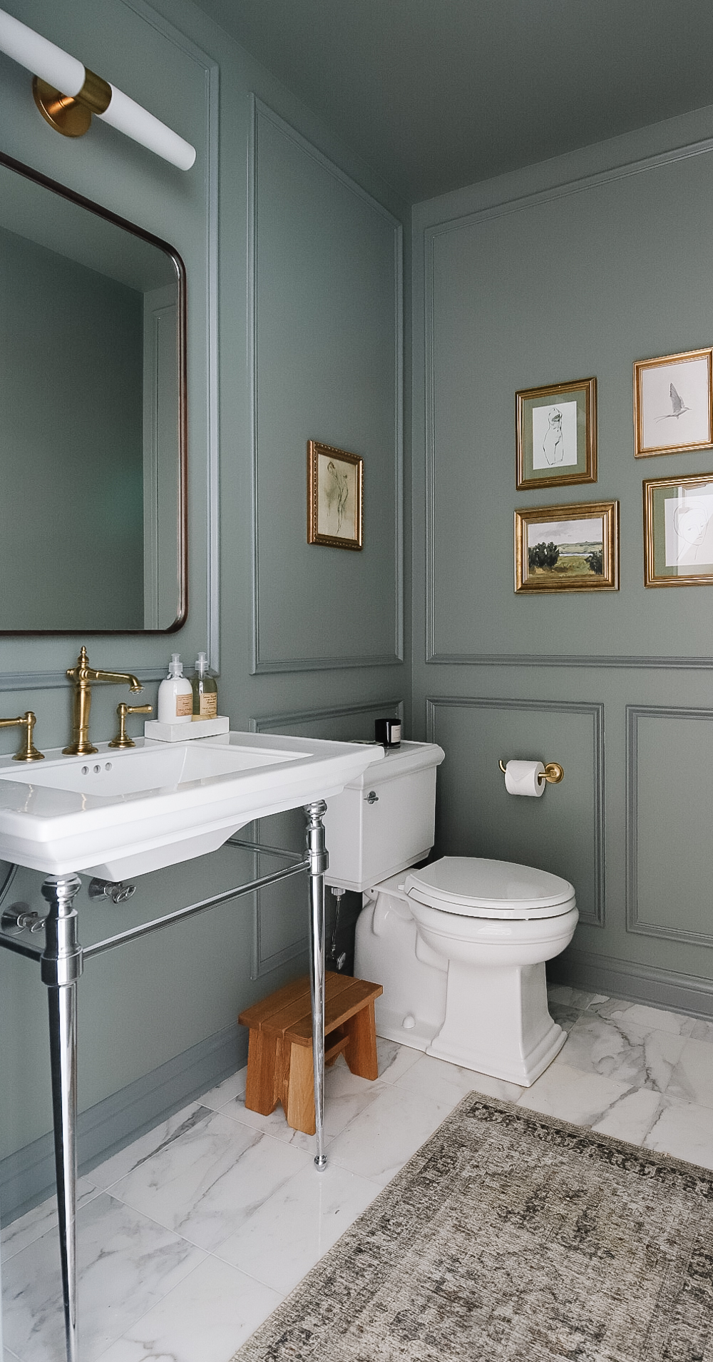
5. Intrigue by Benjamin Moore
For a deep and mysterious color that creates a moody ambiance, look no further than Intrigue. This is a bold, dark teal with jewel-toned richness that can add instant drama to any room.
Why We Love It
- Bold Statement: This color creates a striking, elegant backdrop.
- Depth and Drama: Ideal for creating a sense of coziness and richness, perfect for bold design statements.
- Pair It With: Metallic accents like gold or brass, or soft neutrals like grey or beige for balance.
Best Used In: Dining rooms, home offices, or as a dramatic accent wall in a living room.
Source: Making Pretty Spaces
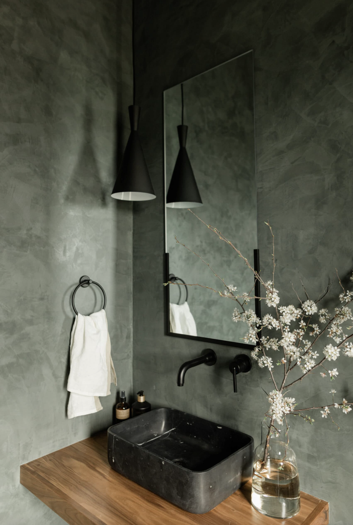
6. Nitty Gritty by Portola Paints
For those who love a more earthy, grounded vibe, Nitty Gritty by Portola Paints is a standout choice. This is a warm, taupe-like neutral that gives off cozy and natural energy. It has just the right amount of depth to add sophistication without overpowering a room.
Why We Love It
- Warm Neutral: Adds warmth and coziness, making it a great choice for living areas.
- Texture-Friendly: Works beautifully with natural materials like wood, stone, or linen.
- Pair It With: Creamy whites, rust, or darker earth tones to create a balanced, cozy palette.
Best Used In: Bedrooms or living rooms that need a soft, welcoming atmosphere.
Source: James May Homes
7. Pewter Green by Sherwin Williams
Pewter Green is a deep, moody green that exudes sophistication. It’s a versatile shade of green that balances between bold and subdued, making it an excellent choice for those who want to add color without overwhelming their space.
Why We Love It
- Timeless Appeal: Dark greens are a growing trend in interior design, and Pewter Green hits the mark.
- Grounding: This color brings a calming, grounded feel, especially in spaces where you want to relax.
- Pair It With: Gold accents, warm woods, or soft whites to balance its depth.
Best Used In: Entryways, dining rooms, or as a statement wall in living areas.
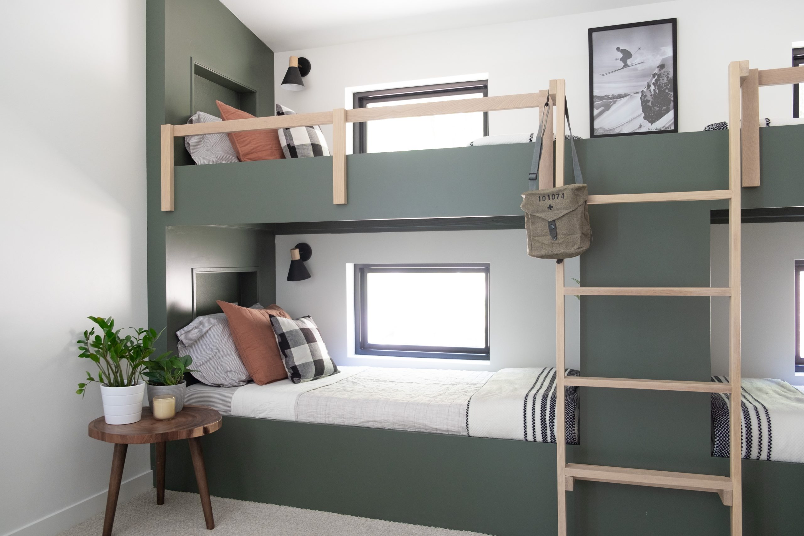
Source: The Stil Interior
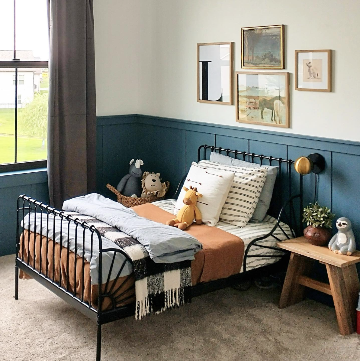
8. Newburg Green by Benjamin Moore
Newburg Green is a rich, deep blue-green color that’s both timeless and trendy. It adds a sense of calm and refinement to any room and pairs beautifully with a variety of styles, from coastal to modern to traditional.
Why We Love It
- Elegant and Versatile: Works well in both contemporary and classic spaces.
- Calming and Cool: Brings a sense of tranquility, making it perfect for spaces where you want to relax.
- Pair It With: Warm wood accents, brass fixtures, or crisp white trim for a balanced look.
Best Used In: Living rooms, bedrooms, or any space where you want a rich, elegant feel.
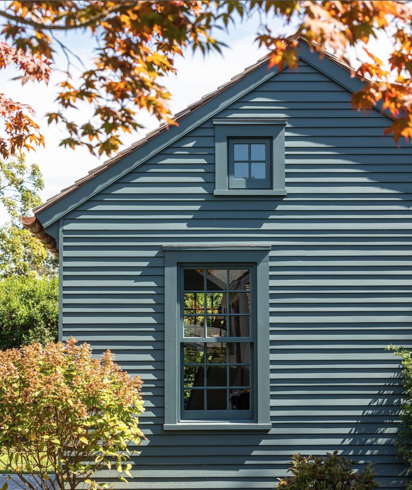
9. Narragansett Green by Benjamin Moore
If you’re looking for a slightly darker take on green, Narragansett Green is a great option. This color borders on navy but with a green undertone, giving it a unique depth and richness. It’s bold without being too overpowering.
Why We Love It
- Bold but Usable: Dark and moody without feeling too intense.
- Goes with Everything: This deep green pairs beautifully with both cool and warm tones.
- Pair It With: Soft golds, creamy whites, or lighter greens to create balance.
Best Used In: Exteriors, dining rooms, libraries, or as a moody bedroom color for a luxurious feel.
10. Black Magic by Sherwin Williams
Black Magic is a deep, velvety black that’s perfect for those looking to add a bold, modern touch to their home. While painting a room black may seem intimidating, when used strategically, Black Magic can add depth and a touch of glamour.
Why We Love It
- Striking and Sophisticated: Black adds a sense of luxury and mystery to a space.
- Not Overpowering: Despite its depth, Black Magic can be surprisingly versatile and not overly harsh.
- Pair It With: Crisp whites for high contrast or warm wood tones for an industrial-chic feel.
Best Used In: Bathrooms, small powder rooms, or exteriors to create a high-impact statement.
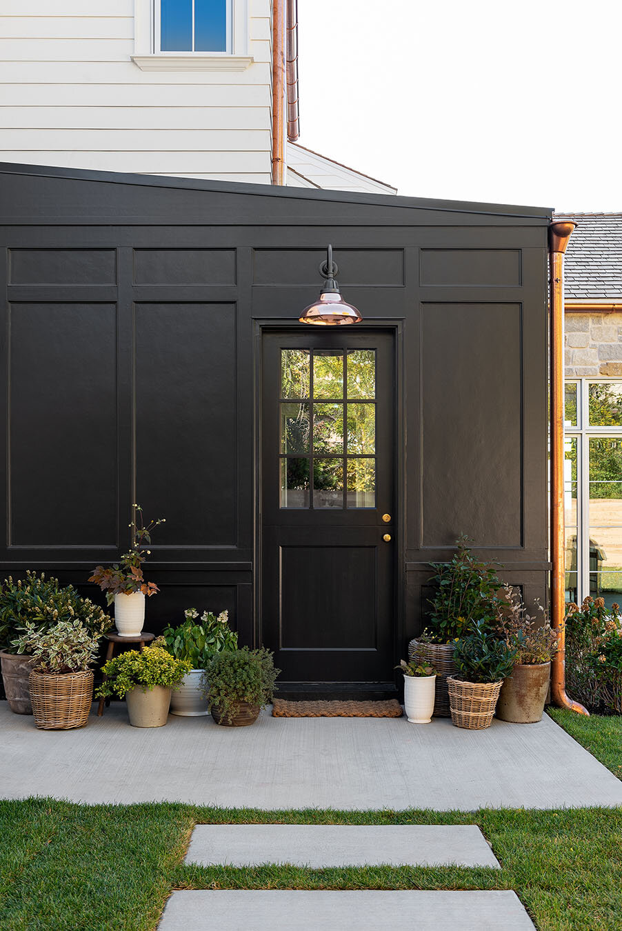
Source: Studio McGee
Choosing the perfect paint color for your home is all about finding the right balance between personal style and the mood you want to create. Whether you’re drawn to bold, dramatic hues like Black Magic or prefer the soft, neutral tones of Accessible Beige, each of these top ten colors brings something special to the table. With options ranging from timeless whites to deep, moody greens, there’s a shade here for every room and design style.
So, grab a brush, pick your favorite, and get ready to transform your space! These timeless shades are sure to make your home feel refreshed and stylish, no matter the season.
Talk to you later, friends!

PS Do you have a favorite paint color in your home? Share a photo with us! Tag us @thestillinterior
Is your SPACE ready for a CHANGE?
The Still Interior is here to help. We will put methods in place to keep your home looking beautiful, and most importantly functional for your lifestyle.