

As we step into 2025, the major paint brands have unveiled their Color of the Year selections, each offering a glimpse into the cultural, emotional, and aesthetic shifts that are shaping the world around us.
This year, the Color of the Year selections reflect a desire for warmth, grounding, and vibrancy. From earthy neutrals to bold, vibrant hues, the colors chosen by Pantone, Dunn-Edwards, Benjamin Moore, Behr, Sherwin-Williams, and Glidden bring a sense of renewal and optimism, while remaining deeply connected to nature and modern living.
In this journal post, we’ll take a closer look at each of these colors, explore their meanings, and discuss how to use them in your own home. Whether you’re redecorating an entire room or simply looking to update your space with some fresh accent colors, these color choices are sure to inspire.
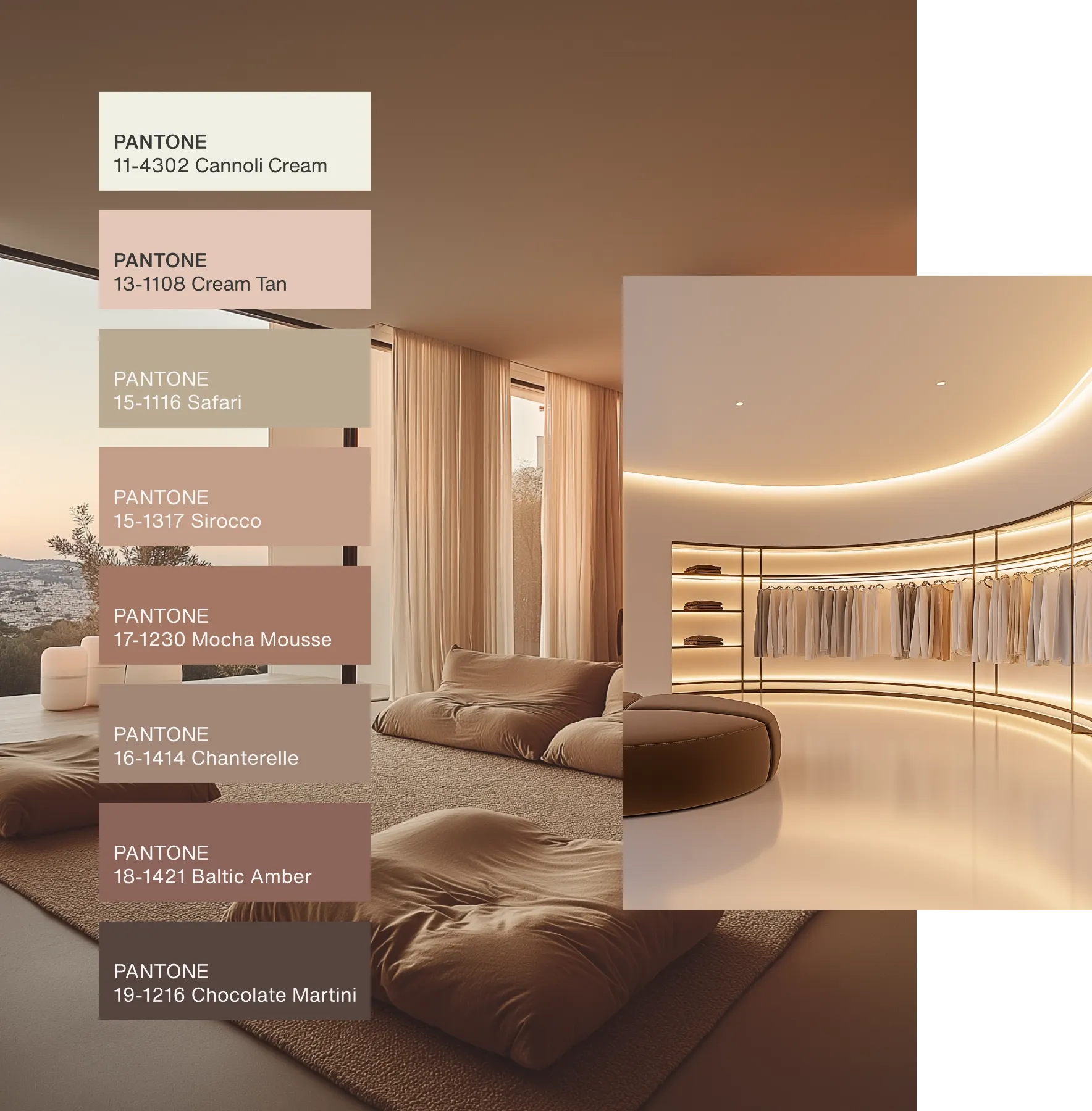
Source: Pantone
Pantone’s Color of the Year 2025: “Mocha Mousse”
Pantone has long been a leader in the color world, setting the tone for the design industry with their Color of the Year selections. For 2025, Pantone has chosen Mocha Mousse, a rich, warm brown with subtle undertones of caramel and cocoa. This velvety shade combines the earthiness of brown with a soft, creamy warmth that makes it feel both luxurious and inviting.
Why Mocha Mousse?
Mocha Mousse represents the growing cultural shift toward grounded, natural tones and earthy aesthetics. After years of cool tones dominating the design landscape, we’re seeing a return to warmth. In times of uncertainty, people are increasingly looking for spaces that make them feel rooted and comfortable, and Mocha Mousse does exactly that. It’s a timeless, classic hue that evokes feelings of relaxation, stability, and a connection to nature.
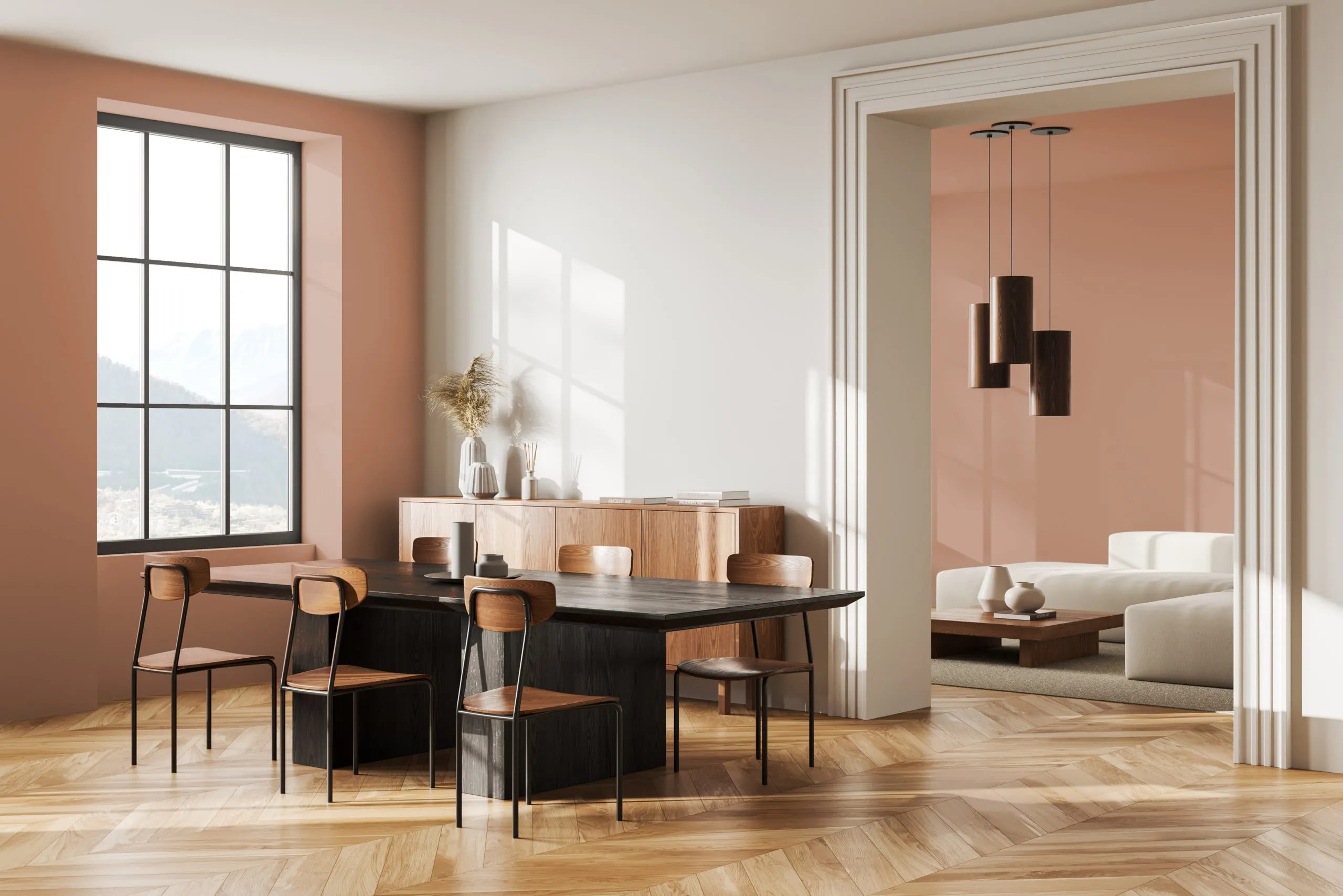
Source: Dunn Edwards
Dunn-Edwards’ Color of the Year 2025: “Carmelized”
Dunn-Edwards’ Color of the Year for 2025 is Carmelized, warm terracotta brown with soft, earthy tones reminiscent of sunbaked clay. The ultimate new neutral, this sophisticated color demonstrates versatility, pairing well with various styles, from vintage-inspired interiors to sleek, contemporary spaces that embrace the concept of ‘old is new.’
Why Carmelized?
Carmelized captures the essence of comfort and warmth. In an age where many are seeking refuge from the chaos of the world, this color symbolizes solace, inviting people to create spaces that feel nurturing and safe. The richness of Carmelized adds a layer of sophistication without feeling overwhelming, making it ideal for creating spaces that are both cozy and refined.
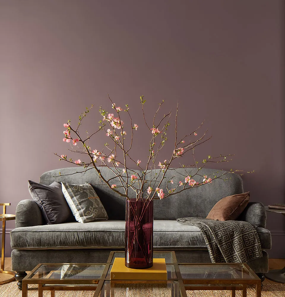
Source: Benjamin Moore
Benjamin Moore’s Color of the Year 2025: “Cinnamon Slate”
Benjamin Moore has chosen Cinnamon Slate, a warm, delicate mix of heathered plum and velvety brown, as its Color of the Year for 2025. This rich, earthy hue offers both warmth and sophistication, blending the comforting qualities of cinnamon with the cool elegance of slate.
Why Cinnamon Slate?
Cinnamon Slate is a reflection of the evolving need for homes that feel both nurturing and stylish. As people continue to spend more time in their homes, there’s a growing desire to create spaces that are cozy but also dynamic, timeless yet contemporary. The deep, earthy tones of Cinnamon Slate meet these needs, offering a color that’s both grounded and full of personality.

Source: Behr
Behr’s Color of the Year 2025: “Rumors”
Behr has chosen Rumors, a deep ruby red that will add a level of sophistication and depth to any room.
Why Rumors?
Rumors represents the subtle yet powerful way that color can shape our emotions and experiences. Behr chose Rumors to encourage feelings of strength with a warmth and rich allure that will add a sense of power to a space.
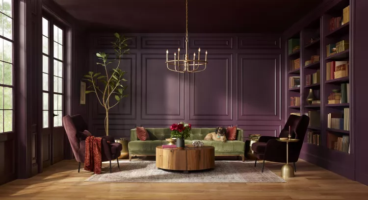
Source: Glidden
Glidden’s Color of the Year 2025: “Purple Basil”
Glidden has chosen Purple Basil, a bold and dynamic purple with earthy undertones, as its Color of the Year for 2025. This unique shade combines the calm of purple with the grounding qualities of brown, resulting in a color that feels both calming and energizing at the same time.
Why Purple Basil?
Purple Basil is a color that celebrates creativity, individuality, and a sense of playfulness. In a world that increasingly values personal expression and authenticity, Glidden’s choice reflects a desire to add bold, unexpected colors into our homes. It’s a color that feels both luxurious and approachable, making it a perfect choice for those looking to infuse their interiors with personality.
Source: Fancy House Interior Design
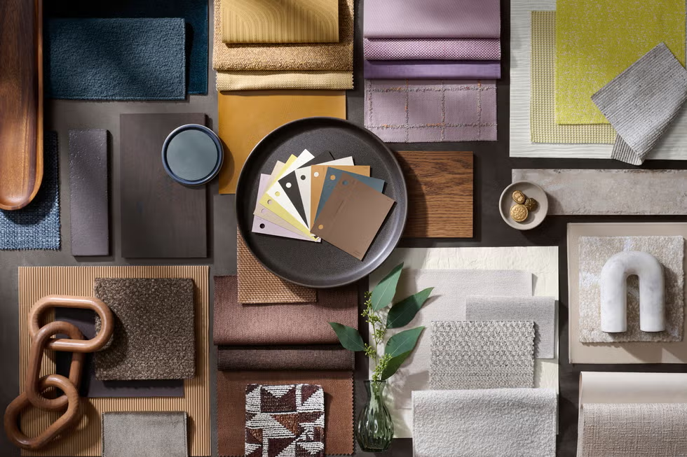
Sherwin-Williams’ First-Ever Color Capsule of the Year
Sherwin-Williams went big this year by naming not one, but nine colors in the brand’s first-ever Color Capsule of the Year. The handful of hues is designed to capture the world of color from classic to cutting edge. The line-up includes Grounded (SW 6089), Sunbleached (SW 9585), Chartreuse (SW 0073), Rain Cloud (SW 9639), Clove (SW 9605), Malabar (SW 9110), Bosc Pear (SW 6390), White Snow (SW 9541), and Mauve Finery (SW 6282).
Why a Capsule?
For the last 15 years, Sherwin Williams has focused on a single pivotal hue for inspiration. This year they are celebrating the beauty of color with an expertly edited curation of essential colors – forever favorites and future classics, a mix of brightness and subtlety, freshness and familiarity. The effortless adaptability of this palette makes it easy to create comfortable, personal sanctuaries that embody the truest sense of home.
The Color of the Year selections for 2025 offer a rich and diverse palette that speaks to the evolving moods and desires of society. Whether you’re drawn to the warm earth tones of Mocha Mousse and Carmelized or the more vibrant energy of Purple Basil, there’s a color for every taste and every style. These colors not only create inviting, beautiful spaces but also encourage us to connect with the world around us—whether that’s through nature, warmth, or personal expression.
As you begin to transform your space this year, consider how these colors can inspire your own design journey. With the right combination of hues, textures, and decor, your home can reflect the beauty and optimism that 2025 promises.
Talk to you later, friends!
PS What is your favorite Color of the Year? Have you used any in your home? Share a photo with us! Tag us @thestillinterior
Is your SPACE ready for a CHANGE?
The Still Interior is here to help. We will put methods in place to keep your home looking beautiful, and most importantly functional for your lifestyle.